


- Your cart is empty Browse Shop
Mastering Color Palettes with Paletton: The Designer’s Secret Weapon
15/03/2024
0
284
Every great design starts with the perfect palette. Whether you’re branding a bakery, crafting a blog layout, or building an online store, the right combination of hues can make—or break—your visual impact. Enter Paletton: an interactive, browser-based color-wheel tool that empowers you to generate, preview, and export harmonious palettes in seconds.
Why Paletton Belongs in Your Toolkit?
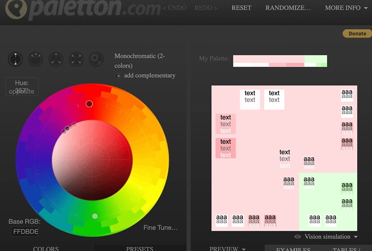
- Instant Harmony
Slide your base hue around the color wheel and watch Paletton automatically generate matching tints, triads, complements, or tetrads—no guesswork, just perfect balance. - Live UI Previews
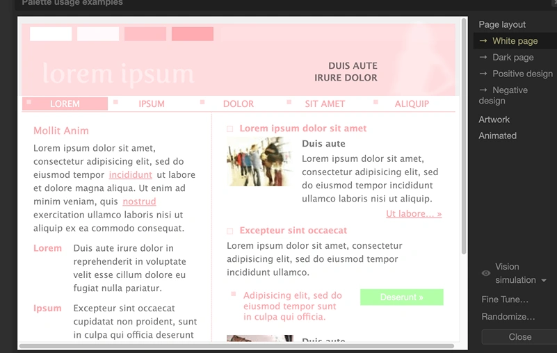
See your palette applied to sample buttons, backgrounds, text, and more, so you know exactly how it will look in real-world interfaces. - Flexible Export
Grab hex codes, CSS snippets, or a quick PNG preview to drop straight into Canva, Photoshop, or your favorite code editor. - No Sign-Up Required
Jump right in—no account, no fees, just pure color bliss.
How to Use Paletton in 4 Simple Steps
- Launch the Wheel Go to https://paletton.com and click anywhere on the large color circle to pick your primary hue.
- Choose Your Scheme On the right panel, toggle between “Mono,” “Adjacent,” “Triad,” or “Tetrad” to see instantly updated palettes. For pastels, drag the saturation slider down or choose lighter tints.
- Preview Live Scroll the “Demo” area to view buttons, headers, and text blocks styled with your chosen palette—no surprises when you implement it.
- Export & Apply Click Export → Save as PNG for a quick visual reference, or copy the hex/CSS for seamless integration into your design files.
Pro Tips for Next-Level Color Work
- Fine-Tune Saturation & Brightness
Use the small sliders beside each hue marker to adjust intensity—perfect for achieving that soft pastel look. - Save Your Faves
Bookmark your palette’s unique URL (found at the top) so you can return instantly without re-building. - Combine with Coolors.co
If you need a quick “inspiration dump,” run Coolors.co alongside Paletton: pick a palette in Coolors, paste its base color into Paletton, and explore advanced scheme variations. - Test for Contrast
Toggle the “Vision Simulation” (bottom of the palette panel) to check accessibility—ensure your text and buttons are readable for everyone.
Real-World Example: Crafting a Pastel Theme
- Base Hue: Set your wheel to #F7B8A7 (a gentle coral).
- Scheme: Choose “Triad” for three soft pastels.
- Demo: Watch how buttons adopt #A7D7F7 (sky blue) and backgrounds shift to #F7E3A7 (buttery yellow).
- Outcome: A sweet, friendly pastel brand that’s perfect for bakeries, baby-care services, or lifestyle blogs
What’s Next?
Now that you’ve unlocked Paletton’s power, go ahead and experiment:
- Build a brand palette in Canva in under 10 seconds.
- Share your favorite palettes on Pinterest or Dribbble to inspire others.
- Embed your code directly into your website stylesheet for pixel-perfect consistency.
Ready to give it a try?
🔗 Jump into Paletton now → https://paletton.com/
And let your colors shine. 🌈✨