


- Your cart is empty Browse Shop
Master Every Hue: Extract Perfect Palettes from Your Photos with iColorPalette
15/03/2024
0
294
Nothing captures the essence of a mood or space better than color drawn straight from a photo. Whether you’ve snapped a sun-lit living room or a vibrant café corner, iColorPalette makes it effortless to pull out the exact hues you need—no guessing, no trial and error.
Why iColorPalette Is a Game-Changer
- True-to-Life Extraction
Upload any image—an interior shot, brand photo, or moodboard—and iColorPalette instantly analyzes its pixels to surface the dominant and accent colors. The result? A ready-to-use palette that matches your source exactly, so your designs or décor never feel “off.” - Speed & Simplicity
No sign-up required. Just drag & drop your photo (or paste a URL), and within seconds you’ll see a set of 5–8 hex codes neatly lined up. Download in multiple formats (PNG, PDF, CSS) with a single click. - Endless Inspiration
Stuck on where to start? Browse the site’s gallery of user-submitted palettes, filter by style (Pastel, Vibrant, Earthy), and discover how others have translated real-world scenes into harmonious color schemes.
How to Use iColorPalette in 3 Easy Steps
- Upload Your Photo
Click “Choose File” or paste an image URL. Your interior shot—whether a cozy bedroom or a sleek workspace—loads right into the palette generator. - Review & Tweak
iColorPalette automatically presents your key hues. Need to swap one out? Click a color swatch to lock it, then drag the slider to fine-tune brightness or saturation. - Export & Implement
Hit Export and select your format: - PNG for quick mockups
- PDF to share with clients or teammates
- CSS/hex list for seamless web integration
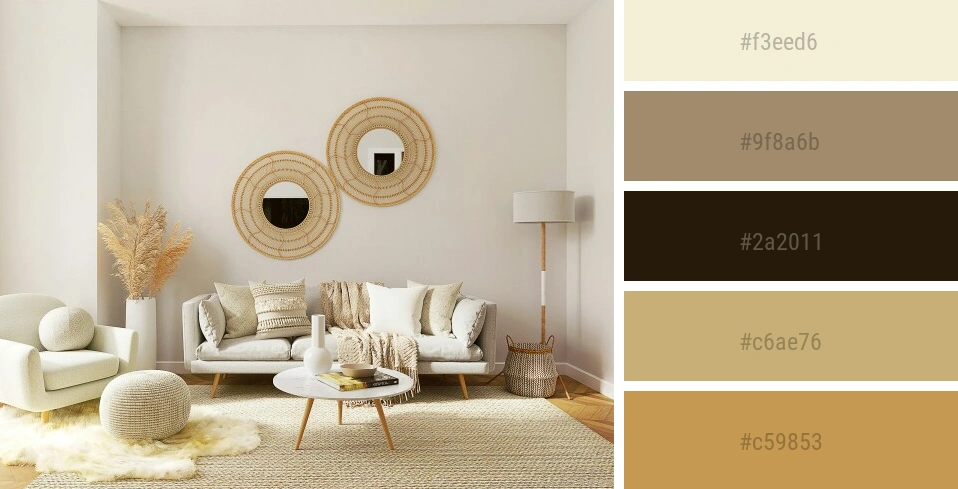
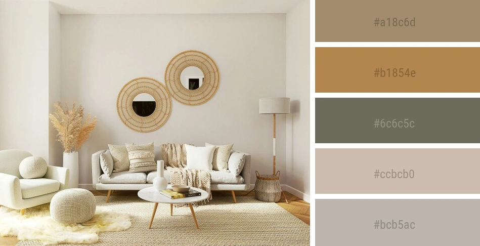
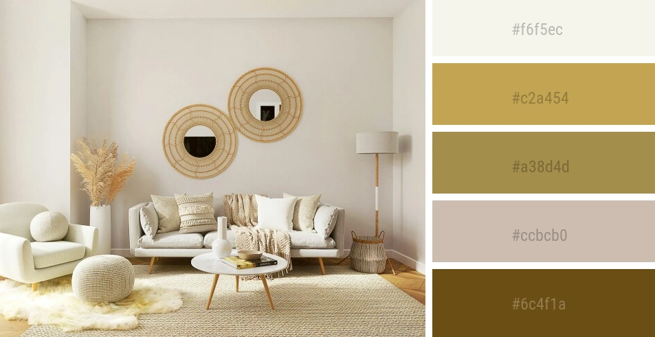
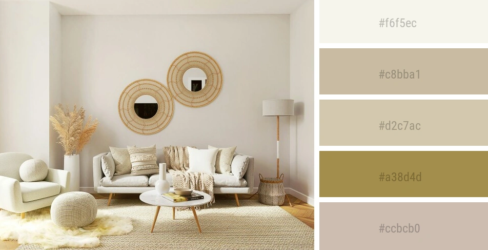
Real-World Use Case: From Photo to Room Makeover
- Start with Inspiration
Imagine you’ve found a photo of a Scandinavian-style living room—light oak floors, moss-green cushions, and crisp white walls. - Generate Your Palette
Upload the photo to iColorPalette and watch it identify #EFEFEF (white), #D4C7A1 (light oak), #8DA27F (moss green), and two complementary accents. - Bring It Home
Use #D4C7A1 for your shelving units, #8DA27F on accent pillows, and #EFEFEF throughout your walls and trim. Instantly your room will echo that Scandi-chic vibe.
Pro Tips for Next-Level Color Picking
- Choose High-Quality Photos: Clear, well-lit images yield more accurate color extraction.
- Lock & Refine: If one color is too dark or too muted, lock the others and nudge just that swatch until it feels right.
- Combine Tools: After extracting your core palette, paste one of those hex codes into Paletton or Coolors.co to explore complementary schemes or pastel variations.
- Save Your Favorites: Bookmark your palette URL or download a PDF. Store them in a “Color Inspiration” folder so you can revisit later.
Beyond Interiors: Endless Applications
- Branding: Match your logo and website colors to a product photo or brand moodboard.
- Web Design: Quickly generate CSS variables for a cohesive UI theme.
- Print & Packaging: Ensure your packaging design echoes an in-nature shot or product photo for instant brand harmony.
Ready to Capture Your World in Color?
Transform any snapshot into a polished palette in seconds.
🔗 Try iColorPalette now → https://icolorpalette.com
And let every hue tell your story. 🌈✨